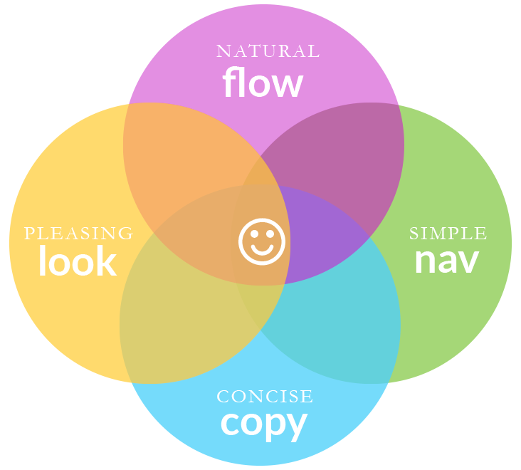
predictable page progression removes task friction
users find what they need faster when they have fewer choices
short, direct messaging means users have to read less
a clean appearance minimizes distraction and makes the user feel welcome
design for the use case rather than the case being used

They are likely focusing on multiple actions at the same time (like walking, waiting or talking).
Design should let them do one task easily.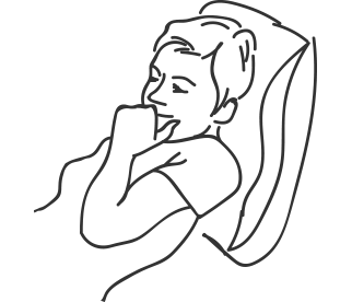
They are focused and stationary. They don’t have the features of their laptops and aren’t expecting to use them.
Design should let them read easily.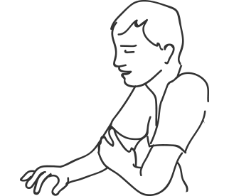
They are in a meeting, on an airplane or on the couch. They have access to all their files but are looking at a smaller screen.
Design should let them feel organized within a rectangular space.
They are focused here many hours a day. They have the ability to use full features and the space to see it all.
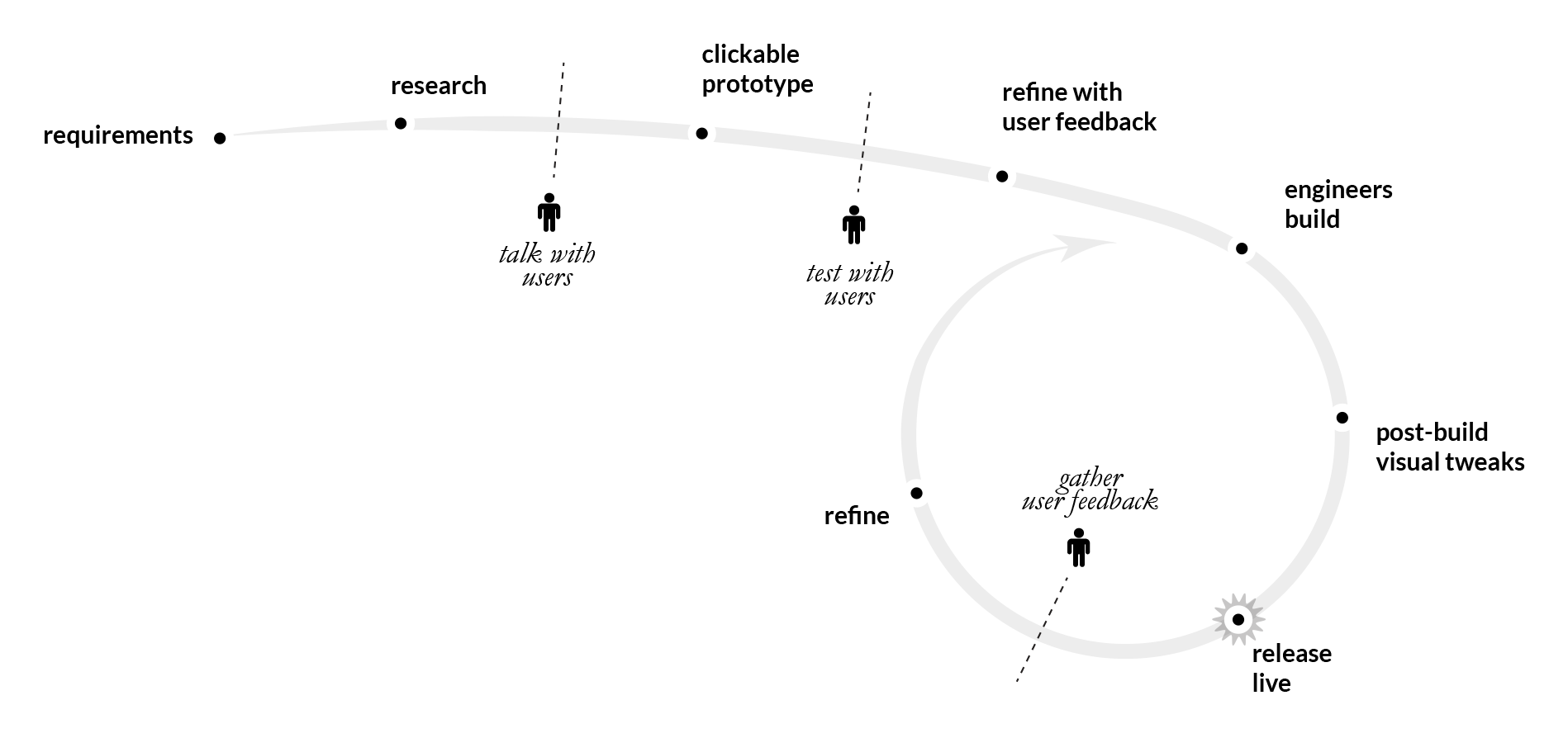
Design should let them feel focused and organized within a large space.a rapid process that allows for user feedback and easy refinement
